


The decision by Marco Rubio’s State Department to mandate a return to Times New Roman as its official typeface and to ban the sans serif Calibri — which had been adopted by the Biden administration to be more accessible to those with reading disabilities — was but one more absurd and ignorant attack by this regime on inclusion as woke.
In its chronically credulous coverage of the Trump administration, The New York Times chose to take seriously and thus elevate and normalize the State Department decree, examining the fine points of the faces’ respective designs and legibility in a weekend feature. But The Times left out one important aspect of the story: history.
This is not the first time that an authoritarian regime has anointed and banned typefaces. In a most unexpected invocation of Godwin’s Law — that as any discussion continues online, the probability of comparison to Nazis approaches one — it must be noted that Hitler did it, too. He even imprisoned a typographical opponent.
In my book The Gutenberg Parenthesis, I tell the story of typographical polarization in the early days of print, as there came a cultural divide between nations adopting roman or blackletter typefaces. Roman faces were heirs to the first and to my mind still the most sublimely beautiful and subtly human exemplar of the form, Jenson, created by Nicolas Jenson in Venice in 1470. Most of Europe went that way. German-speaking lands opted instead for blackletter such as that used by their favorite son, Johannes Gutenberg, who invented movable type in Mainz about twenty years earlier. His first fonts mimicked heavy scribal penmanship.
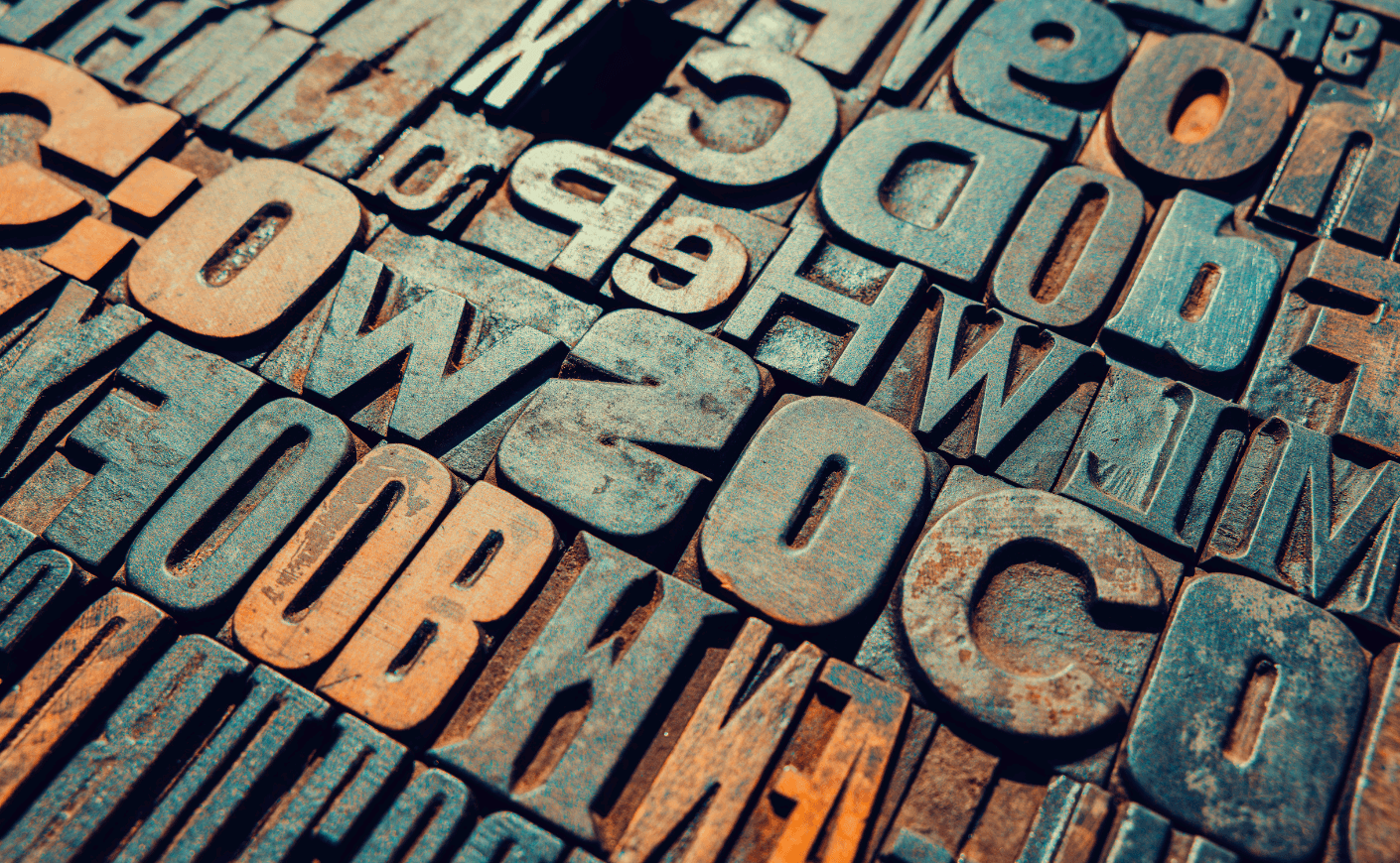
(Before continuing with our story, typographers will expect me to instruct readers that a typeface is a design, such as Times New Roman, while a font is a particular size and style of it, such as 12-point condensed Times New Roman. I should also point out that blackletter is sometimes known as gothic type, as it brings to mind gothic architecture. Just to confuse the typographical noncognoscenti, gothic is also used to describe sans serif faces such as Helvetica and Calibri. But nevermind that.)
Now fast forward to 1911, when the German Reichstag voted to anoint blackletter Fraktur as the official typeface of the nation. There was opposition, as some lobbied for Antiqua, a somewhat more readable and rounded variation. Choosing Fraktur was thus a matter of nationalism over internationalism. By 1928, more than half of German publications were printed with Fraktur. It instantly telegraphed Germanity and, to most of the world, was utterly unreadable.

Adolf Hitler required the use of Fraktur in government documents, though he was not a fan. He complained to the Reichstag in 1934 that the ornate face “does not fit well in this age of steel and iron, glass and concrete, of womanly beauty and manly strength, of head raised high and intention defiant.”
A few years before, in 1928, legendary typographer Jan Tschichold published Die Neue Typographie (The New Typography). Inspired by Bauhaus modernism, Tschichold rejected ornamentation — namely serifs, the graceful little feet and fillips that adorn letters—in favor of a single, standardized, sans serif typeface, proclaiming, “These objects, designed without reference to the aesthetics of the past, have been created by a new kind of man: the engineer!” Tsichold condemned Fraktur: “The emphatically national, exclusivist character of Fraktur... contradicts present-day transnational bonds between people and forces their inevitable elimination.”
Until last week and Rubio’s typographical pronouncement, we might have laughed at the idea that Tschichold’s opinions could land him in political peril. But it did. “A few years after Die neue Typographie, Hitler came. I was accused of creating ‘un-German’ typography and art, and so I preferred to leave Germany,” the designer recalled with notable understatement.
The Gestapo raided Tschichold’s Munich home, discovering “incriminating collages by Russian constructivists,” according to a later Guardian article. Authorities confiscated all copies of his book from his publisher and ruled that another publication of Tschichold’s “exhibits a subversive tendency incompatible with the aspirations of the nationalist-socialist state.” Tschichold was accused of “cultural Bolshevism” and arrested with his wife. He remained in prison for six weeks until, with the help of a friendly police officer, he obtained his passport and they escaped to Switzerland.
Meanwhile, Hitler changed his mind. Realizing that Fraktur was too German, too unintelligible to most, and thus incompatible with world domination, Nazi Germany reversed course in 1941, when Martin Bormann issued an order labeling Fraktur, without basis, “Jew-letters.” Said print historian Albert Kapr: “Were stupidity or race hatred the motives for this measure? The most important reason for discarding the national form in printing policy was to enable the military orders of the occupying German forces—which had at this time subjugated half of Europe—to be read by the oppressed nations.” Joseph Goebbels lauded the change: “And our language can truly become a world language.”
As for Tschichold, he moved to London, where he took charge of the design of Penguin books. After the war, he renounced Die neue Typographie, writing in 1959: “I detected most shocking parallels between the teachings of Die neue Typographie and National Socialism and Fascism”—that is, a “ruthless restriction of type faces” and “the more or less militaristic arrangement of lines.”
“Typography should be allowed individuality; this is to appear as different as the people around us, just as there are girls and men, fat and thin, wise and stupid, serious and gay, easily-pleased and fussy,” Tschichold said in his recantation. “The aim of typography must not be expression, least of all self-expression, but perfect communication achieved by skill... Typography is a servant and nothing more.” In the 1960s, Tschichold designed a serifed typeface for a consortium of German type houses called Sabon. For the iconic covers of Penguin paperbacks, he chose a sans serif face, Gill Sans.
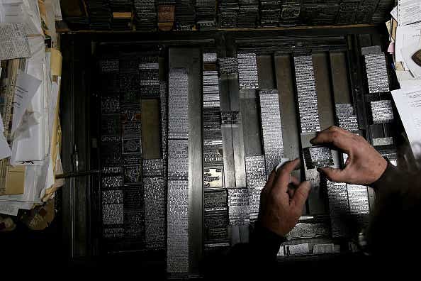
As for the history of the Trump administration’s favored Times New Roman, I tell that story as well in my upcoming book, Hot Type, a cultural history of the Linotype, the typesetting machine that opened the floodgates of mass media. Stanley Morison, another fabled typographer and a historian of newspapers, was engaged by The Times of London in 1929 to redesign it “with the ambition of producing the finest piece of newspaper printing in the world,” he wrote in The Monotype Recorder. The Times noted that “the print of newspapers must change with social habits.... In the eighteenth century The Times was largely read in coffee-houses; in the nineteenth it came to be read in trains; and in the twentieth it is read in cars and airliners.”
Morison’s first, perhaps most radical move was to replace The Times’ blackletter logo with roman capitals, also deleting the odd period that had appeared at the name’s end. Next he set about replacing the newspaper’s venerable body type, Caslon.
(Pardon this personal typographical diversion: After the rough launch of the magazine I created in 1990, Entertainment Weekly, Time Inc. executives tried to blame our problems on the design. As I tell that story in Magazine, then-editor-in-chief Jason McManus berated me for my “god-damned post-modern font.” That typeface was Caslon, first cut by William Caslon in London in 1722. It so happened that in the lobby of the then-Time-Life Building at 1271 Sixth Avenue, there stood — and still stands — a story-high sculpture of a font, none other than Caslon. Fonts carry such emotion.)
In London, Morison spent three years trying out various designs, eventually settling on a variation of Plantin (Robert Granjon’s sixteenth-century Gros Cicero). One goal of the design was to fit more text into narrow lines. Another was to render it more readable by raising the x-height — the depth of a lowercase letter’s body — to make it seem bigger. The face was tested on the press and subjected to review by “a distinguished ophthalmic authority” to be deemed, in Morison’s words, “worthy of The Times —masculine, English, direct, simple, not more novel than it behoveth it to be novel, and absolutely free from faddishness and frivolity.”
At its debut in October 1932, the editors boasted that its typeface was “truly new and, as comparison will show, from an impression of spontaneous boldness and clearness beyond the capacity of its predecessor even under the best of circumstances. If this be the effect, it is because everything freakish or precious has been diligently eschewed and design both in headings and in the body of the paper has been healthily subordinated to the strict purpose of aiding the eye.”
Five years after Morison’s death in 1968, The Times discarded its eponymous face for Europa, designed for its faster presses. It was replaced again when Rupert Murdoch broke the Fleet Street printing unions with his move to Wapping and new technologies — photocomposition and offset-lithographic presses — which necessitated new designs. Type is never static.
Morison’s typographical ally and confidant was a remarkable woman named Beatrice Warde, who in 1930 delivered a dinner speech that became a seminal essay on typography, “The Crystal Goblet.” In it, she declared that “printing should be invisible.” Like the finest crystal, the finest typography “is calculated to reveal rather than to hide the beautiful thing which it was meant to contain.... Type well used is invisible as type.... But you may spend endless years of happy experiment in devising that crystalline goblet which is worthy to hold the vintage of the human mind.” Morison agreed: “Typography is the efficient means to an essentially utilitarian and only accidentally aesthetic end, for enjoyment of patterns is rarely the reader’s chief aim. Therefore, any disposition of printing material which, whatever the intention, has the effect of coming between author and reader is wrong.”
Let the record show that Warde could not abide the use of sans serif faces as body type. She called designers who used it inside books “aesthetic nudists.” In a 1940 speech before the American Institute of Graphics Arts entitled “Harsh Words,” book designer T.M. Cleland concurred, mourning sans serif faces as “simplification for simpletons, and those are block letters for blockheads.” Indeed.
Jeff Jarvis is emeritus professor of journalism innovation at CUNY, visiting professor at Stony Brook, a fellow at Montclair State, and author of the upcoming book, Hot Type: The Magnificent Machine that Gave Birth to Mass Media and Drove Mark Twain Mad.